
Topic: Epic Fit Screen (pics inside)
So, what happened to this?
You are not logged in. Please login or register.
So, what happened to this?
That looks a lot cooler then what we have now ![]()
It sadly got removed. I loved the old fitting window but I didn't like the old terminal view. If they went back to the old terminal view they'd have to probably rewrite (Needs doing anyway) their back story. The old system was a little too bright and busy but I would like somewhere between what we have now and that.
It took a lot of effort on the graphicians side to create a base like that and we decided to use their time for the actual game instead of creating 15 base insides ![]() Parts of this design have been reused as decorations on the terrain.
Parts of this design have been reused as decorations on the terrain.
It took a lot of effort on the graphicians side to create a base like that and we decided to use their time for the actual game instead of creating 15 base insides
Parts of this design have been reused as decorations on the terrain.
Turn it down a little and give it back as an option! Even if you make it a "Virtual" system I'd be happy. ![]()
Panic button...must...press...
Background looks great. Can we have it? ![]()
Its time to play "find that reused terrain decoration!"

Inb4 CQ in Perpetuum ![]() But I noticed a template button! Is that going to beused for paints or weapon sets?
But I noticed a template button! Is that going to beused for paints or weapon sets? ![]()
Inb4 CQ in Perpetuum
But I noticed a template button! Is that going to beused for paints or weapon sets?
Remember, this is a very very old screenshot. It was gone and changed to the current screen before I started in closed beta. Probably a good year old at least.

That was cool, but so similiar to EVE. I think thats the one part of the answer.
But who cares I really like it.
That is a real shame because it does truly look epic. Not to worried about the background but hell, the fitting screen rocks! I especially like the idea of templates, perhaps fitting templates?
If that image is anything like the future of this game then i made a good choice in comming here...

That is epic! Looking forward to seeing this in-game in 3 years time ![]()
Never mind the cool background, the fitting screen is insanely cool o.0

the actual fitting screen is more practical, the older one was stylish - perhaps they can find something in between when they upgrade the UI engine later.
about the template button: thats a DEV-Client only button to create Hybrids (see older blogposts). The DEVs can kitbash robots by using head, torso and legs of different robots. Its a planned feature for the future of perp that players can do the same.
I would love if I could refit my mechs with just a click of a button - as long I had the needed stuff in my storage.
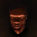
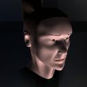
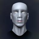
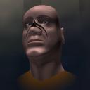
I'm going to Re-Start this old thread because that old fitting screen, was ABSOLUTELY EPIC!!!! the devs SO NEED to bring that back to the game, that 1 window has every bit of info you need for your bot as well as the module equip, the layout and graphics are superb!
Even if you cant get that back, at least get something VERY simular, something new, something freshm right now the holographic images are good, but there is nothing to them cept the colour that changes... and that old fitting screen is a HELL of a lot better then the one currently in the game....
this was posted in general chat in game today... how can u not stay with that? hehe... now the games where it needs to be for the most part, you can spend time the other stations now...
http://2.bp.blogspot.com/_uUn3C9_6Rv0/S … m_0232.png
Let it be 1 for all stations for a while.

I for one dont like this design. It will probably lag like hell whit morre than 1 account and have leaks bugs and what not.
2nd it looks like eves design
3rd. dosent fit the lore?
4th its flatt out ugly and not a pretty design
the only thing i like is the fitting window and the old menu on the topp of the screens it looks cooler than what we got now
You should improve the game in all aspects - not only PvE and PvP, but robot spinning too. Lots of players will appreciate that.
yes 3d terminals look cool, but honstely we realy need other more important things then this. and we all know that time is limited. we cant have all so i think importnt stuff first. so this may be on the list in 2 years or so...
The current one is fine. No need to re-invent the wheel.
Current terminal is fine although, I would really want that old fitting screen.
..., that 1 window has every bit of info you need for your bot...
the amount of informations on that screen is actually LESS then we have in the current Equip window:
relative HP, slot size was not visible on old screen, while the top left slot info chart was useless, and "tracking" was removed from game long ago.
neither of those two screens is actually optimized...
Powered by PunBB, supported by Informer Technologies, Inc.
Currently installed 3 official extensions. Copyright © 2003–2009 PunBB.
Generated in 0.068 seconds (89% PHP - 11% DB) with 31 queries
Copyright © Avatar Creations


